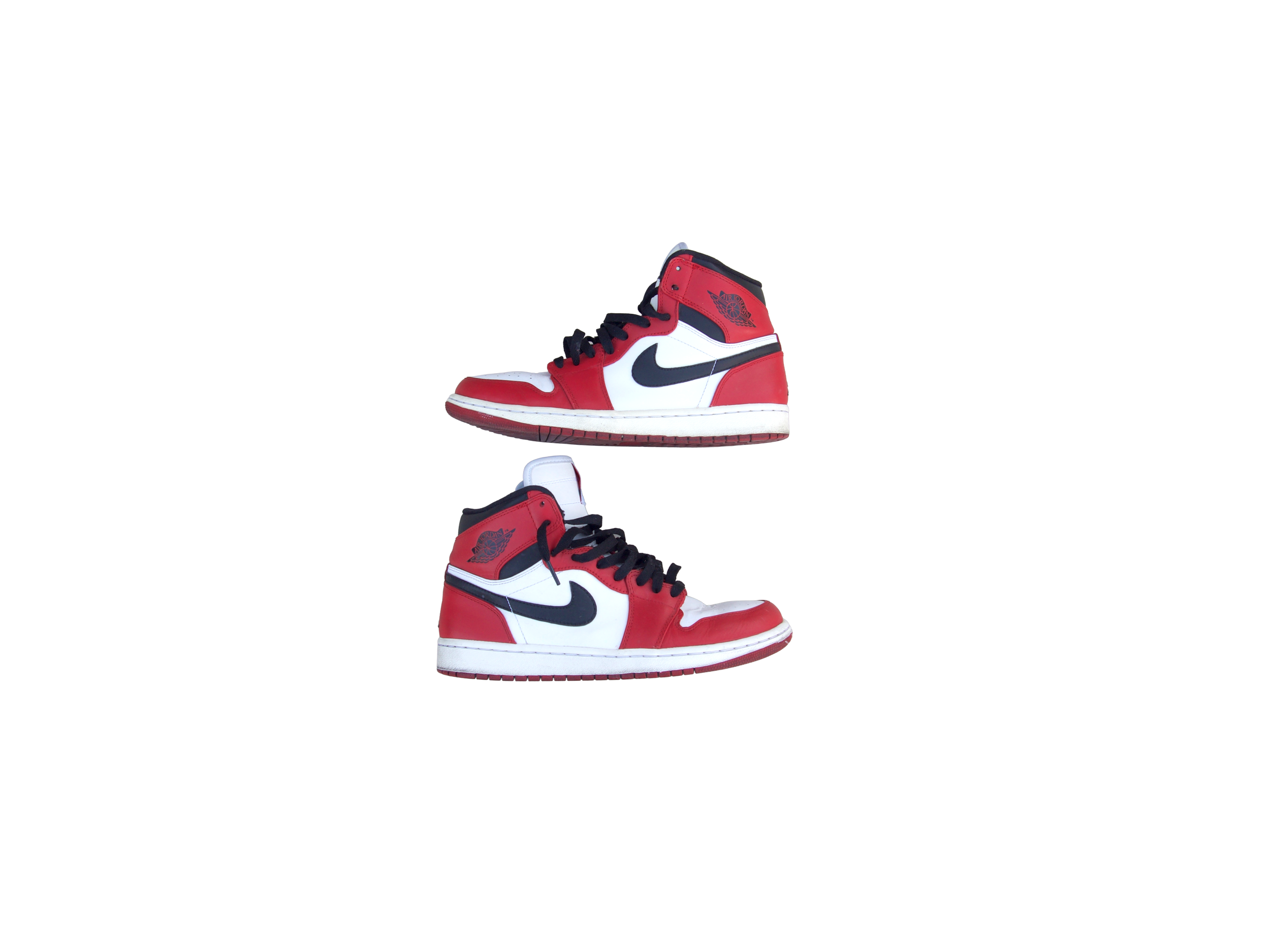
 Image 1 of 2
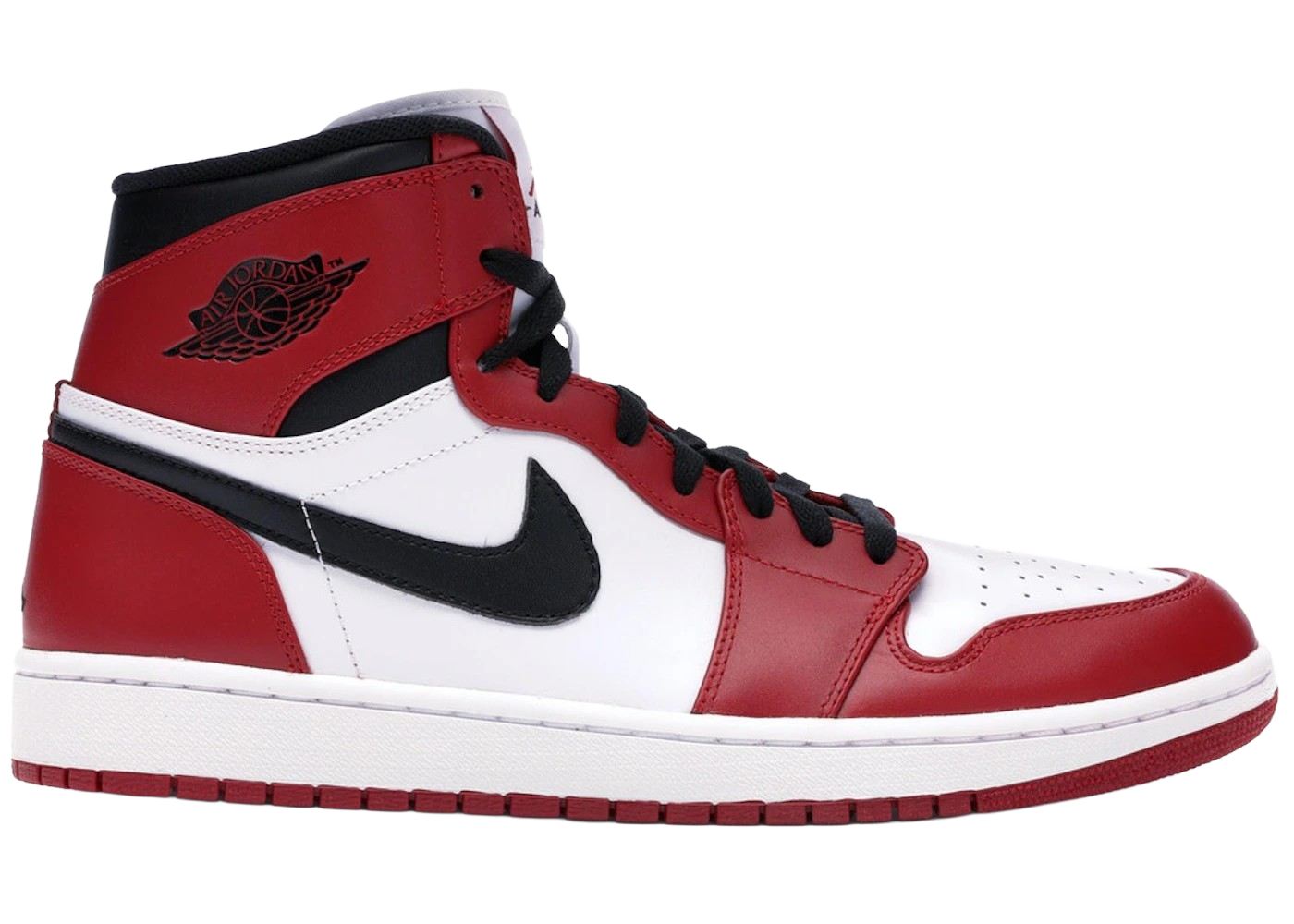 Image 2 of 2
The last one came out in 1994. Then nothing. When it finally came back in 2013 it arrived with the wrong tongue label, and people complained, and it sold out anyway.
Look at the tongue on this pair. Red Jumpman, the word AIR underneath it, on a white tag.
That’s the wrong label, and it’s the best thing about this shoe.
Peter Moore drew the Air Jordan 1 in 1984 for a rookie who hadn’t won anything. No dynasty, no six rings, no silhouette logo. A twenty one year old guard from North Carolina and a shoe company taking a swing. Moore’s design wasn’t clever, and that was the point: flat blocks of colour, laid out so the shoe read from the back row of an arena and from a badly printed photograph. The Chicago colourway is the Bulls’ home kit rendered in leather. Nothing about it is subtle and nothing about it has aged, because it was never trying to be modern.
The original tongue carried a red Nike Air label, because in 1985 Jordan Brand didn’t exist. There was no Jumpman. He was a Nike athlete with a signature shoe, and that’s all.
The colourway got its first retro in 1994. Then it went away, and it stayed away for nineteen years.
Nineteen years is long enough for the people who missed it the first time to grow up, get jobs, and be able to afford it when it came back.
When it did come back, in 2013, Nike put Jordan Brand’s own logo on it. Jumpman on the tongue, Jumpman on the heel, in place of the Nike Air that had been there in 1985 and 1994. The forums went off. It was called inauthentic, a cash grab, a remaster that had remastered the wrong details. Two years later, in 2015, Nike released it again with the red Nike Air label restored and the heel Jumpman gone, and that 2015 pair is generally treated as the more correct one.
Here’s where I land on that. The 2013 is a document of a specific corporate moment, when Jordan Brand had become large enough that it wanted its own mark on its own founding shoe, and hadn’t yet worked out that the people buying it cared more about 1985 than about brand architecture. That’s a real thing that happened, and this shoe is the evidence. The 2015 is a better replica. The 2013 is a better artefact.
And underneath the label argument, the thing the 1 actually did was decouple sneakers from sport. People who never played basketball wore them, and kept wearing them, through skate and hip hop and punk and back out again, so that by 1994 the shoe had stopped being equipment and become clothing. That transition is the most consequential thing that has ever happened to footwear, and it happened to this silhouette.
This pair has been worn. The leather has creased across the toe and the midsole has picked up the colour that white rubber picks up. I’d rather tell you that than shoot around it. A Chicago with wear on it is a better object than a deadstock one anyway. Somebody had a life in them, and the shoe was built in 1985 to be played in.
Size: 9
Material: Leather
Colour: Red/White/Black
Details: Well-Traveled/Creased across the toe with midsole discoloration from wear
The last one came out in 1994. Then nothing. When it finally came back in 2013 it arrived with the wrong tongue label, and people complained, and it sold out anyway.
Look at the tongue on this pair. Red Jumpman, the word AIR underneath it, on a white tag.
That’s the wrong label, and it’s the best thing about this shoe.
Peter Moore drew the Air Jordan 1 in 1984 for a rookie who hadn’t won anything. No dynasty, no six rings, no silhouette logo. A twenty one year old guard from North Carolina and a shoe company taking a swing. Moore’s design wasn’t clever, and that was the point: flat blocks of colour, laid out so the shoe read from the back row of an arena and from a badly printed photograph. The Chicago colourway is the Bulls’ home kit rendered in leather. Nothing about it is subtle and nothing about it has aged, because it was never trying to be modern.
The original tongue carried a red Nike Air label, because in 1985 Jordan Brand didn’t exist. There was no Jumpman. He was a Nike athlete with a signature shoe, and that’s all.
The colourway got its first retro in 1994. Then it went away, and it stayed away for nineteen years.
Nineteen years is long enough for the people who missed it the first time to grow up, get jobs, and be able to afford it when it came back.
When it did come back, in 2013, Nike put Jordan Brand’s own logo on it. Jumpman on the tongue, Jumpman on the heel, in place of the Nike Air that had been there in 1985 and 1994. The forums went off. It was called inauthentic, a cash grab, a remaster that had remastered the wrong details. Two years later, in 2015, Nike released it again with the red Nike Air label restored and the heel Jumpman gone, and that 2015 pair is generally treated as the more correct one.
Here’s where I land on that. The 2013 is a document of a specific corporate moment, when Jordan Brand had become large enough that it wanted its own mark on its own founding shoe, and hadn’t yet worked out that the people buying it cared more about 1985 than about brand architecture. That’s a real thing that happened, and this shoe is the evidence. The 2015 is a better replica. The 2013 is a better artefact.
And underneath the label argument, the thing the 1 actually did was decouple sneakers from sport. People who never played basketball wore them, and kept wearing them, through skate and hip hop and punk and back out again, so that by 1994 the shoe had stopped being equipment and become clothing. That transition is the most consequential thing that has ever happened to footwear, and it happened to this silhouette.
This pair has been worn. The leather has creased across the toe and the midsole has picked up the colour that white rubber picks up. I’d rather tell you that than shoot around it. A Chicago with wear on it is a better object than a deadstock one anyway. Somebody had a life in them, and the shoe was built in 1985 to be played in.
Size: 9
Material: Leather
Colour: Red/White/Black
Details: Well-Traveled/Creased across the toe with midsole discoloration from wear